Gridder
The Gridder is the interface where you create your layouts.
Find out how to show the grid on your website.
The Basics
The “Gridder” is a row and column-based layout tool. Add elements by clicking any buttons with a "+". Move elements by dragging them. Resize elements by dragging their corners. Right click elements and rows to see more settings.
The following videos explain some features that might not be obvious.
Stack Element
Use the "Stack" Element to have multiple elements stacked on top of each other in one row.
Multi Language
Install and activate the plugin qTranslate X. Now all texts in the Gridder are translatable!
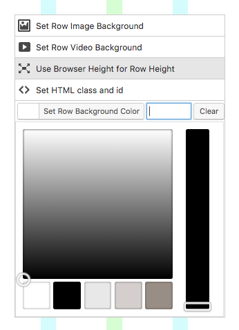
Use Browser Height for Row Height
Right click on an empty spot of a Row and activate "Use Browser Height for Row Height".
A row with "Use Browser Height for Row Height" activated fills the whole browser window. In that type of row you can position texts anywhere, even if the columns are occupied already.
Fullscreen Background Image
Right click on an empty spot of a Row and activate "Use Browser Height for Row Height". Right click the Row again and choose "Set Row Image Background". Since this is just a background image you can still put text or anything else into this row.
If you just want to set a background image for the whole website, please do that in "Customize" → "Background".
Fullscreen Background Video
Right click on an empty spot of a Row and activate "Use Browser Height for Row Height". Right click the Row again and choose "Set Row Video Background". The video will be an autoplaying, looping and muted HTML5 video.
Background Colors
Set a background color for the whole page in "Set Background Color".
Set a row background color by right clicking on an empty spot of a row and choosing "Set Row Background Color".
Space around Elements
Right click an element and enter a number in "space above" and "space below". This is useful in combination with a row background color so the color will be around the element.
Elements with Offsets
Right Click on an element. You will see two inputs "x-offset" and "y-offset". Here you can enter positive or negative numbers to offset the element. This way an image can reach into another row for example. In the mobile view the offsets are disabled.
Columns to the right will always overlap columns to the left. Columns of a row will always overlap columns of a previous row.
Individual Row Gutters
Click on a row gutter which is shown as a gray bar. The bar will turn pink and you can enter a number to individually set the size of this row gutter. You can also right click an empty spot of the row and choose "Set Row Gutter".
Embedding Instagram, SoundClound, etc.
In the Gridder click "+More" → "+Embed". Here you can paste the URL of an Instagram image, a URL of a SoundCloud song and more. Here is a list of all websites that embed should work for.
If the website you want to embed is not in this list, you can still add an <iframe> embed code provided by that website. In the Gridder click "+More" → "+HTML" and add your <iframe> embed code here.
Gridder Defaults
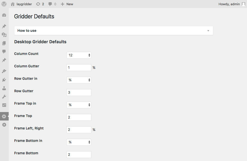
Gridder Defaults is where you change the attributes of all of your grids. Go to "LayGridder" → "Gridder Defaults". Here you can set defaults like "Column Count", "Column Gutter", "Row Gutter", "Frame". You can also set "Frame" to be in pixel or percent.
When you save these defaults and check "Apply Desktop Gridder Defaults", they will be applied to all grids.
When Custom Phone Layouts is activated, you will find all settings for Phone Gridder Defaults here.
If you do not use "Custom Phone Layouts" your phone layout will use the values of "Automatically generated Phone Layout Defaults" which you can find in "Gridder Defaults" too.
Showing the Grid on your Website
There are three ways to show the grid on your website. (id and type optional)
Either as a shortcode that you enter in the WordPress texteditor:
[laygrid]Or using PHP:
<?php echo get_laygrid($id, $type); ?><?php the_laygrid($id, $type); ?>Find out more info about each of these possibilities below:
[laygrid]
[laygrid id="" type=""]Usage: Enter the shortcode in a WordPress texteditor.
Parameters
If both parameters are omitted the current laygrid is returned.
$id(int)(optional) id of a post, page or term
$type(string)(optional) slug of post type, custom post type, "category" or custom taxonomy
the_laygrid($id, $type)
<?php the_laygrid($id, $type); ?>Parameters
If both parameters are omitted the current laygrid is returned.
$id(int)(optional) id of a post, page or term
$type(string)(optional) slug of post type, custom post type, "category" or custom taxonomy
Return Value
echoes string
get_laygrid($id, $type)
<?php echo get_laygrid($id, $type); ?>Parameters
If both parameters are omitted the current laygrid is returned.
$id(int)(optional) id of a post, page or term
$type(string)(optional) slug of post type, custom post type, "category" or custom taxonomy
Return Value
string
Options
Go to "LayGridder" → "Options" to find the available options.
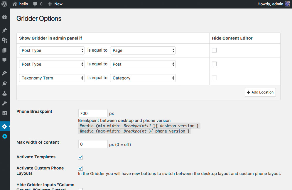
Gridder:
- Show Gridder in admin panel if
- Phone Breakpoint
- Max width of content
- Activate Templates
- Activate Custom Phone Layouts
- Hide Gridder inputs "Column Count", "Column Gutter", "Row Gutter", "Set Frame"
Textformat Options:
- Add "Text Formats" button to all WYSIWYG editors
- For WYSIWYG editors with "Text Formats" button, only show minimal amount of buttons
- Add "Tablet" settings to Textformats
- Tablet Breakpoint for Textformats
- More line-height options
Horizontal Lines:
- Horizontal Line Color
- Horizontal Line Height
Developer Documentation
When using JavaScipt to insert your content
On every page that uses a Grid, specific CSS and JS will be enqueued.
However, you might choose to insert your content using JavaScript so you don't have a page-refresh when you navigate.
In this case you need to use the following code in your functions.php to ensure everything works correctly:
add_action( 'wp_enqueue_scripts', 'my_lg_enqueue_scripts' );
function my_lg_enqueue_scripts(){
    wp_enqueue_style( 'laygrid' );
    wp_enqueue_script('lg-flexbox-polyfill');
    if (get_option('misc_options_simple_parallax', '') == 'on') {
        wp_enqueue_script('lg-parallax');
    }
}
Filters for Elements
lg_frontend_img
lg_frontend_video
lg_frontend_text
lg_frontend_embed
lg_frontend_html
lg_frontend_html5video
lg_frontend_shortcode
lg_frontend_hr
lg_frontend_postthumbnail
$markup String: HTML Markup of Element
$element Object: Object of element
$obj Object: object that contains the whole gridder layout
Example
<?php
function example_callback($markup, $element, $obj){
	// $markup (String): HTML Markup of the element
	// $element (Object): The element as an object
	// $obj (Object): The whole Gridder layout as an object
	error_log(print_r($element, true));
	return $markup;
}
add_filter( 'lg_frontend_img', 'example_callback', 10, 3 );
?>
The example above logs the $element object and returns the markup of the image. (Here is how to enable error_log to log the contents of the object to your debug.log file: https://codex.wordpress.org/Debugging_in_WordPress)
Example
<?php
function lazyload_images_filter($markup, $element){
	$attid = $element->attid;
	$alt = get_post_meta($attid, '_wp_attachment_image_alt', true);

	return
	'<div class="lg-placeholder" style="padding-bottom:'.($element->h/$element->w*100).'%;">
		<img src="data:image/gif;base64,R0lGODlhAQABAAAAACH5BAEKAAEALAAAAAABAAEAAAICTAEAOw==" class="lazyload" data-src="'.$element->sizes->full->url.'" alt="'.$alt.'">
	</div>';
}
add_filter( 'lg_frontend_img', 'lazyload_images_filter', 10, 2 );

function enqueue_lazysizes_js(){
	wp_enqueue_script( 'lazysizes-js', "https://cdnjs.cloudflare.com/ajax/libs/lazysizes/2.0.6/lazysizes.min.js");
}
add_action( 'wp_enqueue_scripts', 'enqueue_lazysizes_js' );
?>
The example above makes images lazyload, using lazysizes.js.
Filter for Captions
lg_frontend_caption
Filter for Element captions. Takes two parameters:$caption String: HTML Markup of Caption
$element Object: Object of element
<?php
function my_caption($caption, $element){
	return '<div>'.$element->caption.'</div>';
}
add_filter('lg_frontend_caption', 'my_caption', 10, 2);
?>
Filters for HTML classes
lg_frontend_elclass
Filter for Element classes. Takes two parameters:$classes String
$element Object
<?php
function my_elclass($classes, $element){
	$classes .= " hello-el";
	return $classes;
}
add_filter('lg_frontend_elclass', 'my_elclass', 10, 2);
?>
lg_frontend_rowclass
Filter for Row classes. Takes one parameter:$classes String
<?php
function my_rowclass($classes){
	$classes .= " hello-row";
	return $classes;
}
add_filter('lg_frontend_rowclass', 'my_rowclass', 10, 1);
?>
Filters for Anchor Tags
lg_frontend_img_opening_anchortag
This filter is for the opening image tag of an image that has a link.Takes two parameters:
$markup (String)
$obj (object)
$obj->url // String
$obj->target // String like target="_blank"
$obj->element // Object
<?php
add_filter('lg_frontend_img_opening_anchortag', function($markup, $obj){
    return '<a href="'.$obj->url.'" '.$obj->target.'>';
}, 10, 2);
?>
lg_frontend_img_caption_opening_anchortag
This filter is for the opening image tag of a caption of an image that has a link.Takes two parameters:
$markup (String)
$obj (object)
$obj->url // String
$obj->target // String like target="_blank"
$obj->element // Object
<?php
add_filter('lg_frontend_img_caption_opening_anchortag', function($markup, $obj){
    return '<a href="'.$obj->url.'" '.$obj->target.'>';
}, 10, 2);
?>
lg_frontend_postthumbnail_opening_anchortag
This filter is for the opening image tag of a post thumbnail.Takes two parameters:
$markup (String)
$obj (object)
$obj->url // String
$obj->element // Object
<?php
add_filter('lg_frontend_postthumbnail_opening_anchortag', function($markup, $obj){
    return '<a href="'.$obj->url.'">';
}, 10, 2);
?>
Filter for Background Color Palette
lg_bg_color_palette
Filter for Background Colors in Gridder. Takes one parameter:$array Array: Colors Array
<?php
function custom_bg_colors($array){
	return array('#ffffff', '#000000' ,'#e9e8e8', '#d4cfcc', '#988e86');
}
add_filter( 'lg_bg_color_palette', 'custom_bg_colors', 10, 1 );
?>
Define your own colors for the background color palette.
Get background color of a grid
lg_get_background_color($id, $type);
Get background color of a grid as a String. Takes two parameters:$id int: id of a post, page or term (optional)
$type int: Slug of post type, custom post type, "category" or custom taxonomy (optional)
<?php
	$bg_color = lg_get_background_color($id, $type);
?>
Creating a Custom Element type
Let's take a look at how to create a custom slideshow element. I recommend you add your own element types by writing a WordPress plugin, so you can reuse that element for your next project. Download the full example from Bitbucket. Put the contents in the folder "/wp-content/plugins/slider-for-laygridder-com/".
CMB2 is a developer WordPress plugin for custom fields. Install CMB2 and create a CMB2 metabox with a file list.
//note the id 'sfl_metabox' which will reappear in the following code snippets
function sfl_register_metabox(){
	$cmb = new_cmb2_box( array(
		'id'            => 'sfl_metabox',
		'title'         => 'Slider'
	) );

	$cmb->add_field( array(
		'name'         => "Slider",
		'id'           => 'sfl_file_list',
		'type'         => 'file_list'
	) );
}
add_action( 'cmb2_admin_init', 'sfl_register_metabox' );
Note our CMB2 metabox has the id "sfl_metabox" which will re-appear in the next code snippets.
Attach this metabox to LayGridder using the "lg_cmb2_modals" filter. Then a new button appears in the Gridder "+Slider".
// Using the 'lg_cmb2_modals' filter, I pass the CMB2 metabox id
function add_cmb2_to_laygridder( $metabox_form_ids ){
	$metabox_form_ids []= 'sfl_metabox';
	return $metabox_form_ids;
}
add_filter( 'lg_cmb2_modals', 'add_cmb2_to_laygridder', 10, 1 );
Write JavaScript that defines the look of the element when it is placed in the Gridder.
//view.js
// this function receives a Backbone model that contains your slideshow's content
var sfl_metabox_view = function(model){
	console.log(model);
	var viewContent = "";

	var file_list = model.get('sfl_file_list');
	if(file_list.val.length > 0){
		if(typeof file_list.val[0].url != "undefined" && file_list.val[0].url != ""){
			viewContent = '<img src="'+file_list.val[0].url+'" draggable="false" style="position:absolute; top:0; left:0; width:100%; height:100%; object-fit:cover;">';
		}
	}

	return String()
	+viewContent
	+'<div style="position:relative; padding-bottom:56.25%;"></div>'
	+'<div style="position:absolute; top:10px; left: 10px; font-size:20px; color: white; z-index: 1; background-color:black; padding: 5px;">'
		+'Slider'
	+'</div>';
};
Enqueue that js.
function enqueue_slider_view_for_gridder(){
	if(LayGridderLocation::$gridder_located_here){
		wp_enqueue_script( 'sfl-slider-gridder-view', SFL_PLUGIN_URL.'/gridder/js/view.js' );
	}
}
add_action( 'admin_enqueue_scripts', 'enqueue_slider_view_for_gridder' );
Now create your php for your frontend view of the slideshow.
function show_slider_on_frontend( $element ){
	// Protip: In your wp-config.php write "define( 'WP_DEBUG', true );" and "define( 'WP_DEBUG_LOG', true );" to use error_log to view the data structure in your debug.log file. More info: https://codex.wordpress.org/Debugging_in_WordPress
	// error_log(print_r($element, true));

	// or just use var_dump
	// var_dump($element);

	$slides = "";

	$sfl_file_list = $element->sfl_file_list->val;

	foreach ($sfl_file_list as $img) {
		$attid = $img->id;
		$alt = get_post_meta($attid, '_wp_attachment_image_alt', true);
		$srcset = wp_get_attachment_image_srcset($attid);

		$slides .=
		'<div class="slideshow-item">
			<img srcset="'.$srcset.'" sizes="100vw" src="'.$img->url.'" alt="'.$alt.'">
		</div>';
	}

	return
	'<div class="slideshow">
		'.$slides.'
	</div>';
}

add_filter( 'lg_frontend_sfl_metabox', 'show_slider_on_frontend', 10, 1 );
Lastly, you will need some kind of Slideshow JavaScript Plugin like Flickity. Please visit the Slider Bitbucket repository for a working example of a slideshow plugin for LayGridder.
Textformats
Textformats is an easy way to create reusable text styles. After you created a textformat you can use it in any WYSIWYG TinyMCE texteditor. When you update a textformat that you have applied to a text previously, the text's style will be updated accordingly.
Here I created a Textformat named "MyFormat":
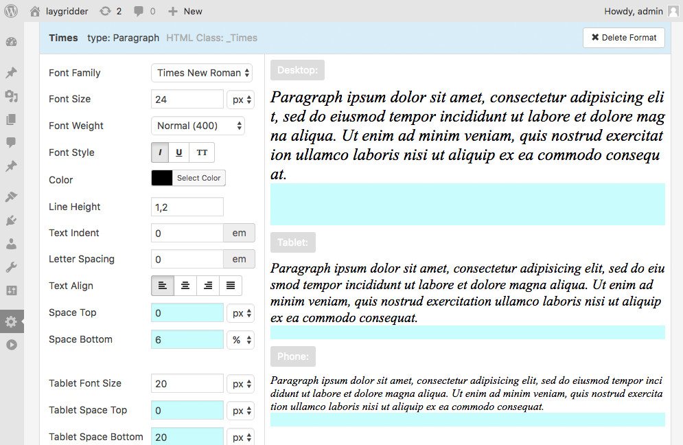
Now I can use this Format in the texteditor. Just select your text and make sure it's unstyled by clicking the  "Clear formatting" button. Then select your format from the "Formats" dropdown:
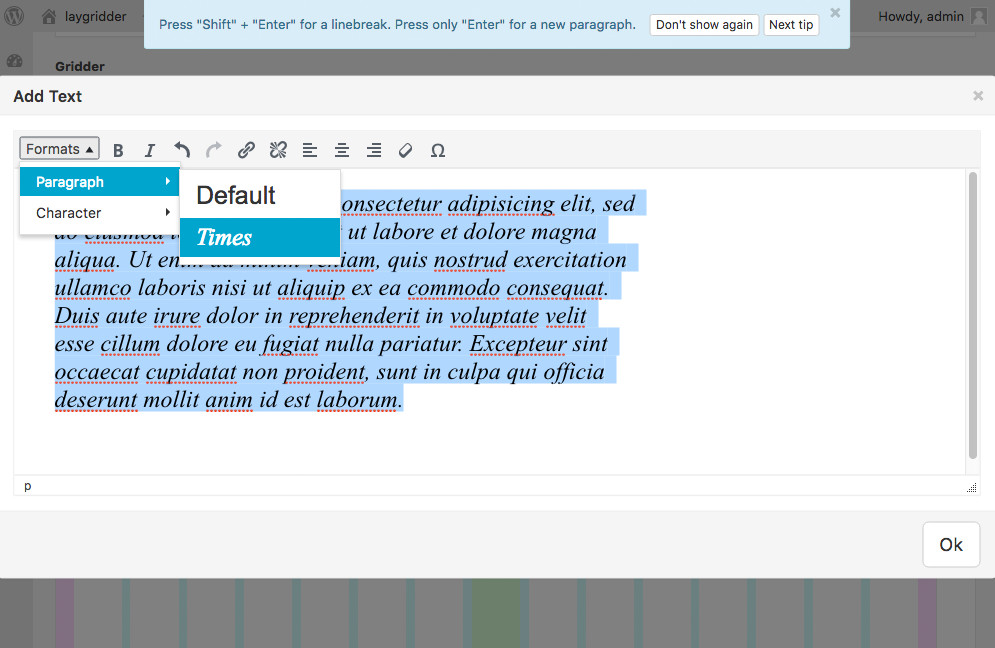
Applying a textformat in the texteditor.
Templates
With "Templates" you can create reusable layouts. Activate "Templates" in the admin panel in "LayGridder" → "Options". A new menu point appears: "LayGridder" → "LayGridder Templates". Here you can create a new page that contains a layout.
After you have successfully created a template, you can insert that template in the Gridder with "+More" → "+Template".
Custom Phone Layouts
With “Custom Phone Layouts” you can switch between desktop and phone layouts in the Gridder. For your phone layout you could just change the order of your elements or even create a different layout with different content.
Please note that the phone layout is simply HTML markup that is set to display:block; when your browser width is below the phone CSS breakpoint.
Activating custom phone layouts
Activate “Custom Phone Layouts” in “LayGridder” → “Options” → “Activate custom phone layouts”.
In your Gridder, new buttons appear for switching between phone and desktop layouts.
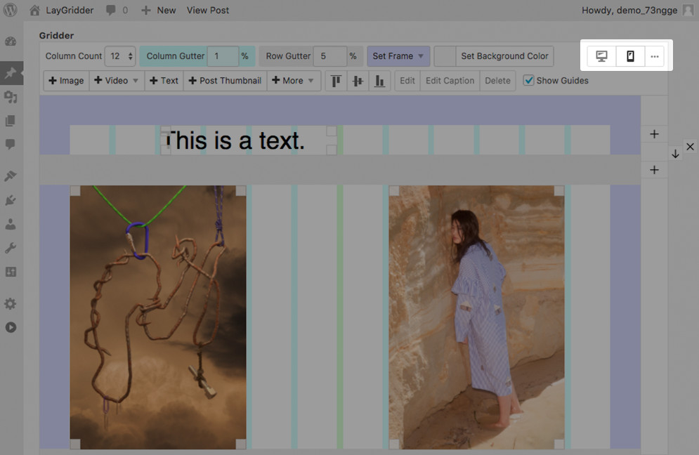
On the top right you have three new buttons: “Desktop”, “Phone” and “Delete phone layout” hidden inside the “…” button
Creating a custom phone layout for the first time
When you click the “Phone” button, a modal appears with three options to start your custom phone layout: “Stack elements on top of each other”, “Copy same layout” and “Start with empty layout”.
Creating a custom phone layout for the first time
How syncing works
If you choose “Stack elements on top of each other” or “Copy same layout” the elements of your desktop layout are copied over to your phone layout. These elements are now synced. This means when you edit an element or delete it in one layout, it will also be edited or deleted in the other layout.
Editing and deleting an element syncs to the other layout
If you want your elements to not sync, you can select them, right-click them and click “Sync element” to toggle whether they are synced or not.
Syncing and unsyncing elements
Adding synced elements to desktop and phone layouts
When you insert new elements into a layout, you can select them, right click them and choose “Insert x elements into desktop/phone layout”. When adding new elements this way they are synced.
You only need to do this if you want to add elements and make them synced.
Insert elements into both layouts this way to make them synced
💫 Thanks to @nevenallgeier and @sucukundbratwurst for letting me use their images. 💫